Metadata Info
Before you get to the content within the page, there are fields that must be completed that provide the title, description, and more for each page.
Required fields have a red asterisk*, others are optional. Here are some fields you might see:
-
Page Name: This will become part of the page’s URL. Letters must be lowercase only, spaces between words are replaced with hyphens, and leading and trailing spaces are not allowed. If the requirements are not met, Cascade will suggest a name—click on ...use the suggested name.
- You will only see this field on initial creation; users can not edit this field after it has been submitted (reach out to the Digital Team for assistance).
-
Placement Folder: Where the page will be housed in the site. Defaults to where you started. Clicking the Placement Folder field lets you choose the location. Once selected click Choose to create the page in that folder.
-
Display Name: The actual name of the page. This appears at the top of the page, in the menu, and in the web browser tab.
-
Title (optional): On pages, this replaces the Display Name when the page is being viewed. The menu link is not changed.
-
Description: On pages, this is a summary of whatever the page is about. Here is how to write a descriptive summary. All pages need to have a Description.
News-Specific Fields
-
Start Date (for news articles): Defaults to the current date and time. If the news item is submitted for publishing and the date is in the future, that is when publishing will take place.
-
Category/Subject (for news articles): One or more values from the drop-down list must be selected—multiple categories can be chosen. Choose only those that apply.
Other fields may appear depending on the type of content.
Top Content
This section is optional.
Choosing a Banner Type allows you to place an image/carousel or a video full-width across the top of the page (or leave it at the default None).
(If you want a photo or video to appear as less than full-width, place it in a Content Row instead.)
Image/Carousel
Image
Click Choose File and insert an image.
Image Alt Text
Describe this image for the visually impaired. If the image contains readable words, make sure they are included. You do not have to name everyone in the image. Just describe what's visible—the information a visually impaired reader would miss by not being able to see this image. Learn more about alt text.
Caption
Optional. If used, the caption will appear under the image.
Carousel
To make a Carousel, add multiple images by clicking on the green "+" plus sign at the right of the Banner Image line, then follow the above steps.
Video
YouTube Video ID
Only videos from YouTube can appear on the website. (Learn more about using the IUP YouTube channel. )
Important: Every YouTube web address (URL) contains an 11-character string of letters and numbers. The original video URL might appear like this:
- https://www.youtube.com/watch?v=uYNNXvzwWB4&ab_channel=IndianaUniversityofPennsylvania
- https://youtu.be/uYNNXvzwWB4
The important part of these URLs is uYNNXvzwWB4
In a longer URL, it appears after v= and before the & (ampersand).
Those characters, and those characters alone, need to be entered in the YouTube Video ID field.
Using additional parts of the URL will result in a blank box instead of the video.
Caption
Optional. If used, the caption will appear under the video.
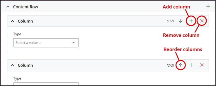
Content Row
This is where the majority of the page content is housed.
The Content Row by default has one column. A content row can have up to 4 Column rows. You can have multiple Content Rows. Additional columns can be added by clicking the column's green plus sign. They can be removed by clicking the red "x." They can be reordered using the up and down arrows.
Type
The Type dropdown contains the different formatting options available, and range from an opent text field to very formatted types of content.
Content Editor
The most common Type, this standard, open WYSIWYG editor can contain text, images, links and more.
Highlight Box
Provides options to create a "callout" type block on the page, using background colors and outlines to call attention to the content. Includes a Heading field and "Content Editor" field.
Accordion/Expanding Content
Adds a single or group of Items, that have a visible portion and a hidden portion that is exposed upon clicking. Learn more about creating an Accordion/Expanding Content section.
YouTube Embed
You must use the 11-character string of letters and numbers at the end of the URL. The original video URL might appear like this:
- https://www.youtube.com/watch?v=uYNNXvzwWB4&ab_channel=IndianaUniversityofPennsylvania
- https://youtu.be/uYNNXvzwWB4
The important part of these URLs is uYNNXvzwWB4
In a longer URL, it appears after v= and before the & (ampersand).
Grid Layout
Formatted content that has an image, heading, and optional link and/or description. You can have one or more items in a grid layout. See an example of this content Type on the Samples page.
Personnel
Single or Group Listing blocks must be created first. Learn all about creating personnel blocks and adding them to pages.
Lively Arts Hub
Only for use by the Lively Arts
Event Details Box
Creates a callout box to promote an event. Either link to an existing event on the Events site, or enter the information manually.
Carousel
Requires three or more images to activate. Learn more about making a carousel slideshow.
Social Media Callout
The social media block must be created first. Reach out to web-team@iup.edu for assistance.
Image Caption
Add an image with a caption.
Quote
The quote block must be created first. Reach out to web-team@iup.edu for assistance.
News Article
Display a published IUP news article, including the thumbnail, title, and date with link.
Tabbed Document: Allows multiple panels to be contained within a single section, using tabs to switch between the panels. The tabbed document block must be created first. Reach out to web-team@iup.edu for assistance.
Expanding Box
Create a heading, optional teaser text, and hidden text that appears when the dropdown arrow is clicked.
Other types are listed, but they are reserved for specific formatting and not intended for most pages.
Column Width
For each Column row, choose the column width (12 = full-width, etc.) The total width of columns in a content row should equal 12.
For example, you can have
- Two columns with a 50/50 split
- 6 column span (50%)/6 column span (50%)
- Three columns with a 33.3/33.3/33.3 split
- 4 column span (33.3%)/4 column span (33.3%)/4 column span (33.3%)
- Two columns with a 60/40 split
- 8 column span (50%)/4 column span (33.3%)
Saving and Publishing
When you’re finished editing, preview your Draft. If it’s ready to publish, choose Submit. Otherwise, choose Edit.
After clicking Submit, you’ll have the option to add comments to let other web maintainers know what was changed. Cascade automatically adds a description, but you can edit that as needed.
Choose Check Content and Submit. Cascade will check your content for quality (including spellcheck and broken links) and for accessibility compliance. Issues like misspellings can be fixed right from the check screen. When you’re ready to publish, click the big check mark in the upper right.
Your page is now in Workflow.
Drafts and Working Copies
When you edit an asset, Cascade CMS automatically saves a draft of your changes. You can preview these changes before submitting them by clicking Preview Draft.
- Drafts allow you to save a working version of an asset to be completed later without the risk of those changes being published accidentally.
- They also allow you to preview your changes on a page as they're made without having to submit a new version of the asset. This is especially useful for assets that require workflow, because you can edit and preview the asset multiple times before submitting it to workflow.
- Drafts, especially automatic Drafts, help prevent loss of data in the event of a browser or computer crash.