Our goal is to create and protect a unified voice of the university in everything we do—all of us across the IUP community. That extends to the way we represent IUP visually. Beyond the IUP logo, we have set a number of graphic identity standards designed to achieve that consistency.

Still Looking for Marketing Help?

If these resources aren't enough for your needs, learn more about how you can work with us on a more strategic level.

Never underestimate the power of our university logo. It is a consistent reminder of the core values we all share and sets the stage for all messaging and communication that follows.

The consistent and proper use of the iconic IUP "block" logo strengthens our recognition and should be used to maximize our visibility while maintaining a unified and identifiable look.

No more wave. No more soaring hawk. This logo replaces all previous institutional logos as the preferred graphic identifier. We use it to represent the academic and administrative programs of IUP.

Red IUP Logo

The logo should always appear at a legible size.

Never go below a height of 25px for digital applications or 1/4” for print applications. Consider if the scale of the logo will present issues with legibility and crispness for other applications (e.g., signage).

Red IUP Logo with registration marks

Free Zone

The free zone, represented by the striped area, extends outward from all four sides of the logotype. Its width is equal to 1/3 the logotype’s height (x). Respect the free zone by keeping all type, photos, boarders, patterns, and other elements out of the zone.
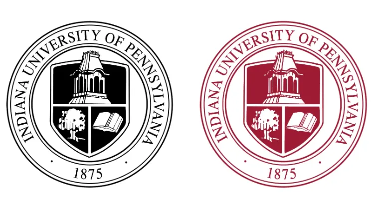
How to Apply the IUP Logo

IUP

When color is an option, the logo should always appear in IUP PMS 201 C Crimson, or the approved equivalent for web or process color.

IUP

When rendering the logo on IUP Crimson, it must be white.

IUP

When color printing isn't an option, the logo must appear in black, not a tonal gray.

IUP

When rendering the logo on a colored field that is NOT IUP Crimson, it must be white.

What Not to Do

IUP logo rotated

Do not rotate or change the orientation of the logo.

IUP logo obscured

Do not obscure any part of the logo.

IUP logo stretched

Don’t stretch the proportions of the logo in any way.

IUP logo in teal

Don’t render the logo in any color not stated on the previous page.

IUP with additional text

Don’t add additional text or sub-heads to the logo.

IUP logo with athletics logo

Don’t embellish the logo with additional graphics or logos.

IUP logo in a sentence

Don’t place the logo within a sentence.

IUP logo spaced out

Don’t adjust the spatial relationship of the individual letters.

IUP wave logo

Don’t use the previous version of the logo.

IUP logo filled with an image

Don’t place image inside logo.

IUP logo overtop an image

Don’t overlay the logo on a photo that affects its legibility.

Combining the Logo with IUP or Department Name

In some cases, our logo needs to be in a "lockup" with the full university name or a departmental name. Our first goal is always finding ways in which the logo can stand for itself—think big brand first. When that is not possible, please contact our brand management team to receive a version with an attached wordmark.

Additional Logo Treatments: Full Title

The university name lockups all follow the same rules as subunit versions. The only difference is that the name of the university is applied in a heavier weight font to heighten it as the master brand.

IUP
IUP
IUP
IUP
IUP

When reversed, all elements of the lockup are applied in white.

Department Lockup System

Logo lockups are created at the desecration of the IUP MarCom team. Colleges, Departments, and Offices qualify as entities that can have a logo lockup. Specific major, organization, or clubs are not approved entities to have a logo lockup. Flush Left, Centered, and Horizontal in full color, black, and white. Please contact our brand management team to receive a department lockup system.

Collection of IUP department lockup styles

Other Entities

Other entities include specific majors, organizations, and clubs. Centered, horizontal one-line, and horizontal two-line layouts in crimson, black, and white are used exclusively for promotional items. Only official names of entities may be used in these lockups. In instances where the official logo lockup cannot be used due to insufficient printing area or spatial constraints, departments and offices may request to use one of the alternative lockups designated for other entities, pending approval.

IUP Special Education logos

Promotional Examples from Other Entities

Merchandise with IUP Special Education logos

Red and black IUP seals

The IUP Seal

It's our ace in the hole. The IUP seal is the most formal of IUP's graphic identifiers and is generally reserved for use in similarly formal and official documents. This includes the following:

  • Diplomas

  • Awards

  • Certificates

  • Medals

  • Contracts

  • Class rings

  • Approved uses on apparel

Do not use the seal unless working directly with our office on one of the above or a similar use. Using older versions of the seal or parts of any version is never permitted.

IUP Athletics logo

IUP Athletics Logos

We get it—the hawk looks awesome. But, given the importance of the university logo, we cannot confuse our academic and athletics marks.

These logos are to be used only for Athletics Department teams and programs, including varsity athletics teams, club sports, and associated programs. Any other use is prohibited without the express permission of the Marketing and Communications Office.

View Athletics Brand Guidelines.

The IUP Colors

Our core colors are crimson and gray. That won't change anytime soon. Any work for the university should start there. Black and white are key components of the IUP brand, too. The brand color palette also includes two accent colors. You'll find them displayed below, but we discourage you from trying to implement them on your own. They're tricky and require the touch of a professional designer.

To make sure that our colors are displayed accurately in all channels, you can use the codes below for help. Quick tip: CMYK is best for print, while RGB is best for digital channels.

Core Palette

crimson

IUP Crimson

PMS: 201 C
CMYK: 25, 100, 78, 20
RGB: 158, 27, 50
HEX: #9d2235

gray

IUP Gray

PMS: 179-12-C
CMYK: 0, 0, 0, 75
RGB: 94, 95, 95
HEX: #5e5f5f

Accent Palette

yellow

Yellow

PMS: 7409 C
CMYK: 8, 29, 100, 0
RGB: 236, 181, 27
HEX: #ecb51b

orange

Orange

CMYK: 0, 67, 90, 0
RGB: 244, 117, 50
HEX: #f47532

pink

Pink

CMYK: 0, 95, 45, 0
RGB: 238, 48, 98
HEX: #ee3062

gradient treatment

Gradient Treatment

Typography and Fonts

The IUP brand uses three typefaces: Avenir by Linotype GmbH, Prospectus Pro S by Lost Type, and Adobe Garamond from Adobe Originals. (There are alternative versions of Garamond available on different platforms.)

Primary Typography

Avenir

Avenir is a geometric sans-serif typeface designed by Adrian Frutiger. It is designed for legibility, and it has a harmonious and sensible appearance for both texts and headlines.

How to use Avenir

The Avenir family is made up of designs with gradual weight changes in order to satisfy the needs of specific text applications. While the book and light weights have similar stroke widths, the book weight is well suited for body text, whereas the light was designed for captions and subhead text. Medium, Heavy, and Black are used for sub-headlines and titles.

Prospectus Pro S

Prospectus Pro S has a classic academic look, but with a sharp, modern edge.

How to use Prospectus Pro S

Prospectus Pro S uses three styles: Regular, Italic, and Light. The italic style is only meant for use in body copy, never for singular or large applications.

Garamond

Garamond is an old-style serif, meaning that its strokes and serifs have a slightly more organic, handwritten feeling than transitional or modern serifs.

How to use Garamond

This typeface communicates classicism, tradition, and grace. Perfect for publishing or brand use with a focus on editorial tradition. The typeface family may be used for editorial storytelling or publishing projects. A distinctive italic style is well suited for emphasizing a message.

Alternate Typography

Arial

Arial features simple, clean lines and open curves, making it highly legible on both print and digital platforms.

Constantina

Constantia is a modulated wedge-serif typeface designed by John Hudson primarily for continuous text in both electronic and paper publishing.

Fonts for IUP Seal, Wordmark, and University Subunits

Wordmarks that are in “lockup” with the IUP logo do not use Prospectus Pro S or Garamond. Please contact our brand management team for help with these elements.

Typography Breakdown

typography breakdown

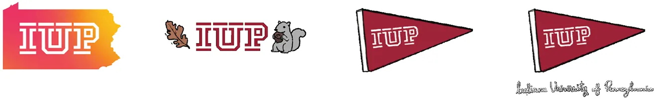
Primary Graphic Elements

Beyond the basics, our designers also use a number of other graphic elements to make IUP marketing messages stand out. The below elements are for reference only. Please connect with
our brand management team for help with materials that require these elements.

Wood Texture

Used to embellish imagery, frame content, and create background texture.

Light gray woodgrain

gray woodgrain

crimson woodgrain

Gradient

In our materials, you will sometimes find an magenta-orange-yellow gradient. We use it to highlight text, color an image, or fill smaller vector elements. It should never be a background or large field of color.

You may occasionally see a gray gradient. We use it to highlight text, tint images, or fill small vector elements. It should never be used as a background or a large field of color. When using gradients, transition from pink to yellow, always ending with the brighter color.

pink/orange gradient

gray woodgrain

White Space

Sometimes, choosing not to employ some of our graphic elements is a powerful design decision. Negative space (as well as the presence of the color white) creates designs that don’t feel overwhelming, busy, and hard to discern.

page layout example

How to Use Wood Textures and Gradients

Combine wood texture with an accent gradient line to create a subtle asset that anchors any design.

print media cover example

letterhead example

Secondary Graphic Elements
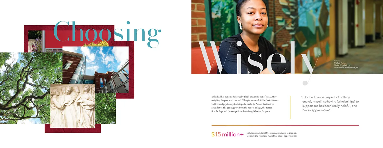
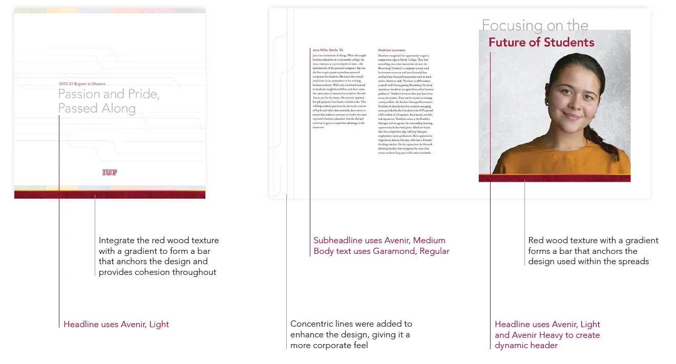
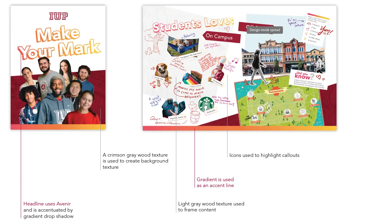
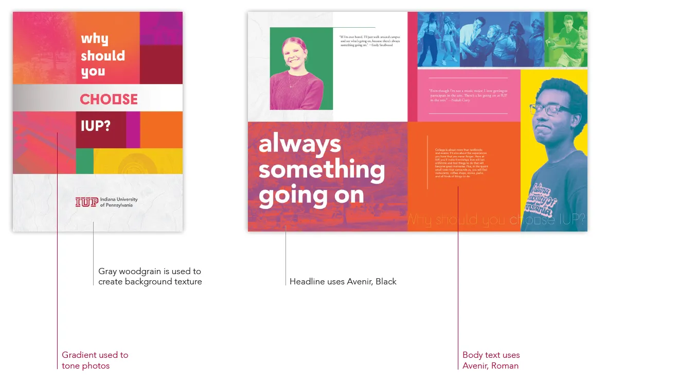
Gradient and Woodgrain Bar

A thin gradient line placed above crimson, grey, or light grey woodgrain, used as a cohesive design element. This branded aesthetic asset serves as an anchor in clean layouts for Canva templates, ideal for postcards, flyers, and publications.

gradient and woodgrain bars

Concentric Lines

concentric lines

Iconography

We use a consistent set of icons that are geometric, simple, and monoweight. You’ll find them in spots where they embellish photography, illustrate concepts, or improve the hierarchy of content.

iconography

Academic Use Norm Logo

Still want to use Norm? Here is a version we call “Cartoon Norm.” This is to be used for non-athletic contexts.

academic Norm logo

Gifs

GIFs should reflect the brand’s tone and enhance storytelling through expressive, engaging visuals. Use them to add personality across social media, emails, and digital content, ensuring they align with the brand voice.

gif examples

Photography

The photography style is student-centered, featuring bright, saturated imagery that captures the energy and diversity of campus life.

photography examples

Examples

2022-23 Report to Donors

The Report to Donors uses white space to create a clean, corporate look intended to appeal to the donors of Indiana University of Pennsylvania.

2022-23 Report to Donors page layout

IUP Junior Piece

IUP Junior Piece page layout

2024 Yield Piece

IUP Yield Piece page layout

Social Media

Social media examples

Trademark Information

All of IUP’s trademarks, service marks, logos, and identifiers are owned by Indiana University of Pennsylvania and cannot be used or reproduced without permission from brand management.

The requirement to secure permission for use of a trademark, service mark, logo, or identifier applies to both on- and offline uses, including use on social media accounts.

Permission to use university-owned trademarks, service marks, logos, and identifiers is ordinarily granted only to offices and departments within Indiana University of Pennsylvania itself that are staffed by full-time employees.

Permission may be granted for the production of licensed apparel and other items. The Indiana University of Pennsylvania licensing program is handled via our licensing agent, the Student Co-operative Association. Contact Director of the Co-op Store, Tim Sharbaugh, via email, timshar@iup.edu

Indiana University of Pennsylvania does not grant permission for the use of its trademarks, service marks, logos, and identifiers on social media accounts not controlled by the university.

Creating and Requesting Graphic Assets

Complying with all these guidelines and standards can be complicated. Never try to create assets like the IUP logo from scratch or pull them from another document. That leads to inconsistencies we try to avoid. Instead, reach out to brand-management@iup.edu.